Quote
Originally posted by: forkushV
you don't need a weatherman to know which way the wind blows
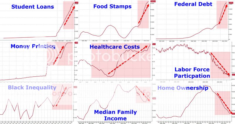
True that. Ordinarily when someone posts nine charts they can't even read, it would be fair to question both their intelligence and their integrity.
But I'll await DonDiego's explanation.
DonDiego thanks forkushV for waiting patiently for an explanation.
DonDiego would like to apologize for posting the "unreadable" charts.
But it was not intentional; it was the result of poor old DonDiego's simple incompetence. DonDiego had access to a larger, more intelligible version, but his normal process of uploading the chart into his Photobucket account did not function on the oversize chart; the chart reduced to the size posted when placed onto Photobucket..
Below is a link to the chart in a larger, . . . and more easily readable size:
The Obama Years
[If anyone more competent than poor old DonDiego can upload the larger chart onto this thread, . . . DonDiego and forkushV, if DonDiego may take the liberty of speaking for forkushV, would appreciate it.]
DonDiego thanks the patient reader for his attention.
Oh, poor old DonDiego did provide the explanation of the red color in the original posting; red represents the Obama Years. The arrows indicate the direction of change during those years.